Choosing the best colour combination for house interiors is more than just picking shades that look appealing—it’s about harnessing the power of color psychology to create spaces that enhance mood, boost energy, and improve visual appeal. Color psychology in interiors explores how hues influence emotions and behaviors; for instance, warm colors like reds and yellows can stimulate energy and appetite, while cool tones such as blues and greens promote relaxation and focus. In a home, the right interior color palettes can make rooms feel larger, cozier, or more vibrant, transforming everyday living into a harmonious experience.
In bustling cities like Bangalore, where homes often blend traditional and modern elements, selecting house color ideas that reflect personal style while considering natural light and room function is key. This blog dives deep into room color combinations, starting with an overview of color psychology and moving into tailored suggestions for each space in your home.
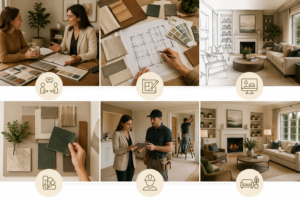
Whether you’re revamping a single room or planning a whole-house scheme, these color schemes for home will inspire practical, beautiful choices. For expert guidance on implementing these ideas, consider consulting professionals like those at Avinnyya, who specialize in creating bespoke interiors that align with your vision.
Understanding Colour Psychology
Color psychology plays a pivotal role in interior color palettes, as different shades evoke specific emotions and set the tone for a space. Warm colors—reds, oranges, and yellows—create energy and warmth, ideal for social areas, while cool colors like blues, greens, and purples foster calmness, perfect for restful zones. Neutral tones, such as beiges and grays, provide balance, acting as a versatile backdrop that amplifies other hues without overwhelming the senses.
The distinction between warm vs. cool colors is fundamental: warm shades advance visually, making spaces feel intimate, whereas cool ones recede, enhancing openness. Neutral tones like whites and taupes offer sophistication and can shift based on undertones—warm neutrals add coziness, cool ones bring modernity. Natural light significantly affects color perception; north-facing rooms may need warmer tones to combat cool light, while south-facing ones benefit from cooler shades to avoid glare.
When choosing house color ideas, consider room size and purpose. Small spaces shine with light, reflective combinations to appear larger, while larger rooms can handle bolder room color combinations for drama. For productivity-focused areas like home offices, opt for stimulating yet non-distracting palettes; relaxation zones favor serene schemes. Test samples in varying lights to ensure the best colour combination for house aligns with your lifestyle.
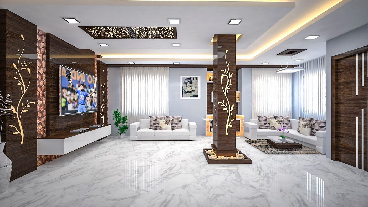
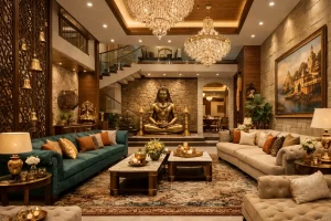
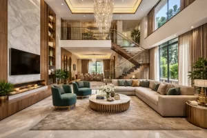
Best Colour Combinations for the Living Room
The living room, often the heart of the home, demands color schemes for home that are inviting and versatile. Here are curated room color combinations to suit various styles.
Soft & Elegant Combos
- Beige + White: This timeless duo creates a serene, spacious feel, with beige adding warmth and white providing crisp contrast. Ideal for minimalist homes, it evokes calmness and pairs well with natural woods.
- Cream + Pastel Green: Cream offers softness, while pastel green brings subtle freshness, promoting relaxation. This combo suits eco-conscious designs, enhancing natural light.
- Light Grey + Warm Yellow: Light grey grounds the space, and warm yellow adds cheerful energy without overwhelming, perfect for family gatherings.
Modern & Minimalistic Combos
- Charcoal Grey + White: Charcoal provides depth and sophistication, balanced by white for a clean, contemporary look. Great for urban apartments.
- Taupe + Black Accents: Taupe’s earthy neutrality with black accents creates bold contrast, ideal for sleek, modern aesthetics.
- Stone Grey + Navy Blue: Stone grey softens navy blue’s intensity, fostering focus and elegance in multifunctional spaces.
Bold & Creative Combos
- Teal + Mustard: Teal’s cool vibrancy meets mustard’s warmth for an eclectic, energizing vibe, stimulating conversation.
- Olive Green + Matte Gold: Olive green evokes nature, paired with matte gold for luxurious pops, adding creativity.
- Terracotta + Ivory: Terracotta brings earthy passion, softened by ivory for a balanced, artistic feel.
Tips for Living Room Colours
Use accent walls to introduce bold hues without commitment, balancing them with neutrals for harmony. Furniture and décor influence choices—match upholstery to walls for cohesion. Consider traffic; durable finishes like matte for high-use areas. For personalized living room color ideas, Avinnyya offers consultations to refine your palette.
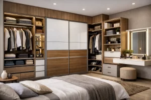
Best Colour Combinations for the Bedroom
Bedrooms should prioritize tranquility, making the best colour combination for house restful retreats through soothing interior color palettes.
Calm & Relaxing Bedroom Palettes
- Lavender + White: Lavender induces serenity, white amplifies light for a peaceful oasis, reducing stress.
- Sky Blue + Grey: Sky blue calms the mind, grey adds subtle depth for a restorative environment.
- Blush Pink + Cream: Blush pink’s gentle warmth with cream creates nurturing softness, ideal for unwinding.
Modern & Sophisticated Bedroom Palettes
- Navy Blue + Beige: Navy promotes deep sleep, beige warms for elegant balance.
- Forest Green + Off-white: Forest green grounds with nature-inspired calm, off-white lightens for modernity.
- Chocolate Brown + Soft Grey: Chocolate brown offers cozy depth, soft grey refines for sophistication.
Romantic & Warm Bedroom Combinations
- Peach + Walnut: Peach’s soft romance pairs with walnut’s richness for intimate warmth.
- Burgundy + Cream: Burgundy’s passion tempered by cream evokes luxury and closeness.
- Coral + Gold Accents: Coral energizes subtly, gold adds glamorous romance.
Tips for Bedroom Colours
Darker tones absorb light for coziness, creating serene environments. Complement bedding and curtains with wall shades for unity. Avoid bright colors that disrupt sleep. For expert bedroom color ideas, visit Avinnyya for tailored designs.
Best Colour Combinations for the Kitchen
Kitchens thrive on color schemes for home that energize and inspire, blending functionality with appeal.
Clean & Timeless Palettes
- White + Light Grey: White keeps it fresh, light grey adds subtle contrast for a timeless, clean look.
- Beige + Charcoal: Beige warms, charcoal grounds for enduring elegance.
- Cream + Walnut Wood: Cream softens, walnut adds natural depth for inviting timelessness.
Vibrant & Energetic Kitchen Palettes
- Mint Green + White: Mint energizes, white brightens for lively cooking spaces.
- Blue + Yellow: Blue calms, yellow stimulates appetite for dynamic vibes.
- Red + Black: Red boosts energy, black modernizes for bold kitchens.
Modern Matte & Premium Combinations
- Olive Green + Brass: Olive’s earthiness with brass’s luxury creates premium matte appeal.
- Navy Blue + Wooden Texture: Navy sophisticates, wood warms for contemporary premium.
- Black + White (monochrome): Monochrome’s stark contrast offers sleek modernity.
Tips for Kitchen Colours
Glossy finishes reflect light, enhancing vibrancy. Lighting alters shades—warm bulbs for cozy tones. Mix walls with cabinets and countertops for cohesion. Avinnyya excels in kitchen transformations.
Best Colour Combinations for Dining Room
Dining rooms benefit from room color combinations that foster warmth and conversation.
Warm & Welcoming Combinations
- Rust + Cream: Rust warms, cream softens for inviting gatherings.
30 Bright, Bold Colors That Go with Orange
- Tan + Olive: Tan’s neutrality with olive’s earthiness creates welcoming harmony.
- Mustard + Grey: Mustard’s cheer balanced by grey for cozy appeal.
Elegant & Classy Combinations
- Maroon + Gold: Maroon’s depth with gold’s opulence exudes class.
- Deep Blue + Beige: Deep blue sophisticates, beige balances for elegance.
- Charcoal + White: Charcoal’s drama with white’s purity for refined class.
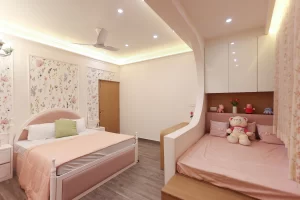
Best Colour Combinations for Kids’ Room
Kids’ rooms need house color ideas that stimulate creativity while being calming.
- Pastel Blue + White: Pastel blue soothes, white brightens for playful serenity.
- Peach + Mint Green: Peach warms, mint refreshes for joyful energy.
- Lavender + Light Yellow: Lavender calms, yellow energizes for balanced fun.
- Multi-colour accents with neutral base: Neutrals ground vibrant accents for versatility.
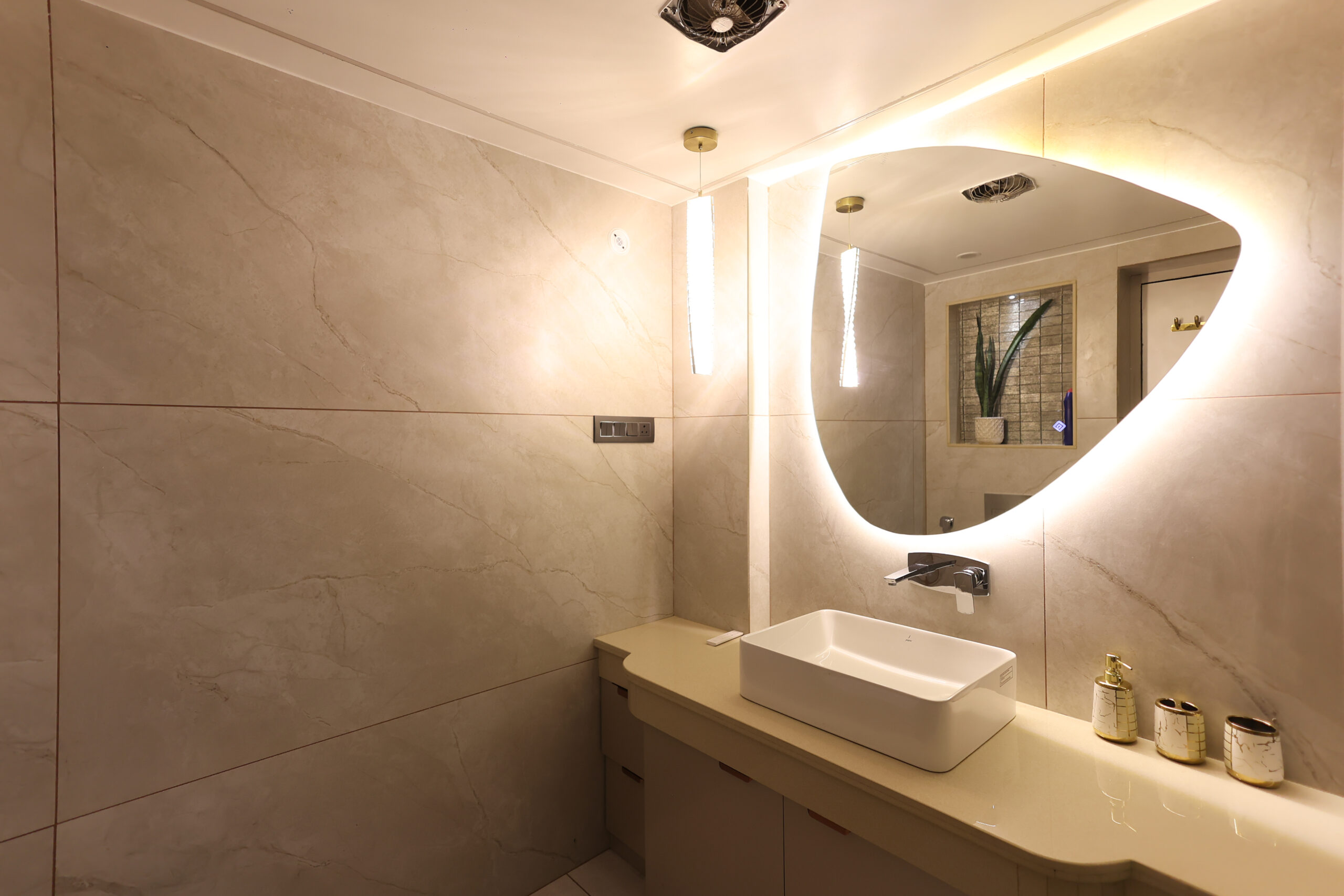
Best Colour Combinations for Bathrooms
Bathrooms favor interior color palettes that evoke spa-like tranquility.
- White + Sea Blue: White cleanses, sea blue relaxes for refreshing vibes.
- Grey + Teal: Grey’s neutrality with teal’s depth creates modern calm.
- Beige + Brown: Beige softens, brown grounds for earthy serenity.
- Monochrome minimalistic (Black + White): Stark contrast for sleek minimalism.
Best Colour Combinations for Home Exterior
Exteriors set first impressions with durable color schemes for home.
- White + Brown: White brightens, brown adds warmth for classic appeal.
- Olive + Cream: Olive’s nature vibe with cream’s softness for inviting exteriors.
- Grey + Blue: Grey’s versatility with blue’s calm for modern curb appeal.
- Sandstone + Dark Brown: Sandstone’s earthiness with dark brown’s contrast for timeless strength.
How to Choose the Right Colour Combination for Your Home
Selecting the best colour combination for house involves assessing lighting—natural light warms cool tones, artificial alters perception. Room purpose guides choices: energizing for kitchens, calming for bedrooms. Furniture integration ensures harmony; match undertones for cohesion.
Incorporate texture paints for depth, using accent walls strategically to highlight features. Test samples in real conditions to avoid regrets. Common mistakes: ignoring undertones, overusing bold colors, or neglecting flow between rooms. For seamless house color ideas, professional input from Avinnyya can refine your vision.
Final Thoughts
The best colour combination for house elevates daily life by aligning with color psychology for balanced, joyful spaces. Mix creativity with practicality—experiment boldly but ground with neutrals. When in doubt, consult a professional interior designer like Avinnyya for customized interior color palettes that transform your home into a personalized haven.